Climate Change

Analysing temperature anomalies
COVID-19 has put the environmental crisis on the back burne. The analysis of historical temperature anomalies below can serve as a reminder that the fight against climate change is still ahead of us!
We wanted to study climate change and used data on the Combined Land-Surface Air and Sea-Surface Water Temperature Anomalies in the Northern Hemisphere at NASA’s Goddard Institute for Space Studies. And we found the tabular data of temperature anomalies here
We run the code below to load the file:
weather <-
  read_csv("https://data.giss.nasa.gov/gistemp/tabledata_v3/NH.Ts+dSST.csv",
           skip = 1,
           na = "***")
We selected the year and the twelve month variables from the weather dataset and ignored the others (J-D, D-N, DJF, etc.) and converted the dataframe from wide to ‘long’ format using the code below:
tidyweather <- weather %>%
  select(-14:-19) %>%
    pivot_longer(cols = 2:13,
                 names_to = "Month",
                 values_to = "delta"
                  )
We inspected our dataframe and it has three variables now, one each for
- year,
- month, and
- delta, or temperature deviation.
Plotting Information
We plot the data using a time-series scatter plot, and added a trendline to this plot. We first created a new variable called date to plot the delta values chronologically.
tidyweather <- tidyweather %>%
  mutate(date = ymd(paste(as.character(Year), Month, "1")),
         month = month(date, label=TRUE),
         year = year(date))

ggplot(tidyweather, aes(x=date, y = delta))+
  geom_point()+
  geom_smooth(color="red") +
  theme_bw() +
  labs (
    title = "Weather Anomalies"
  )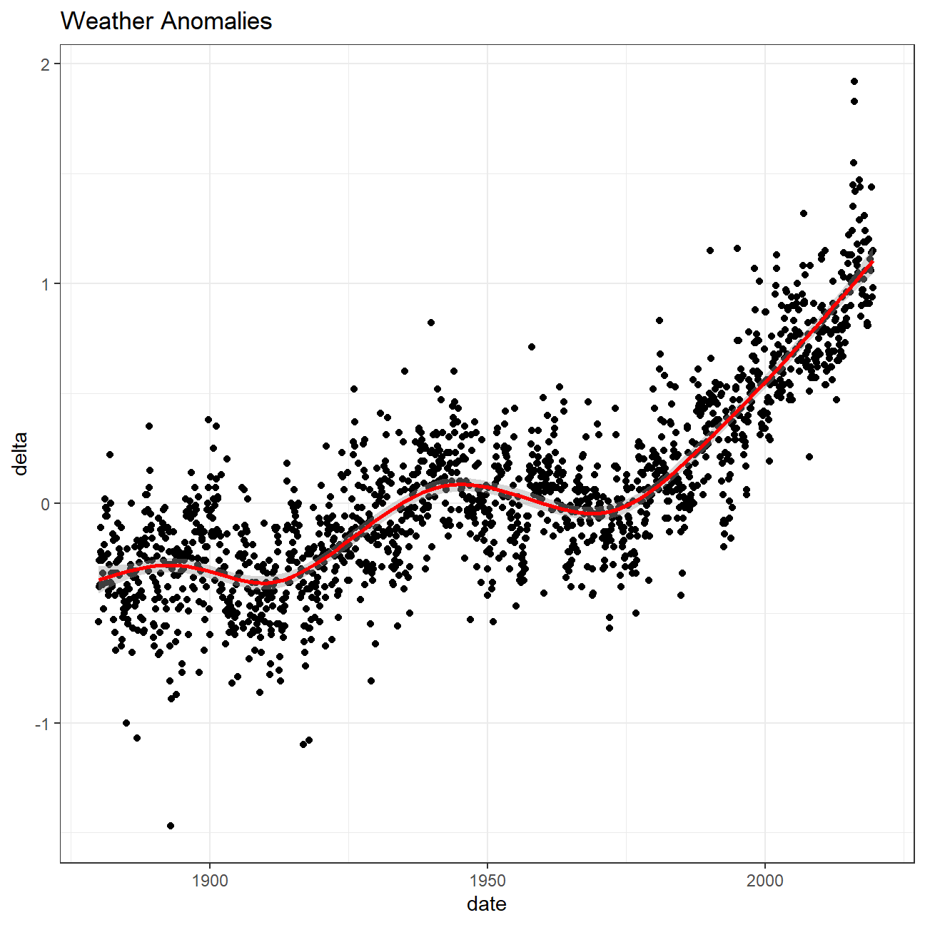
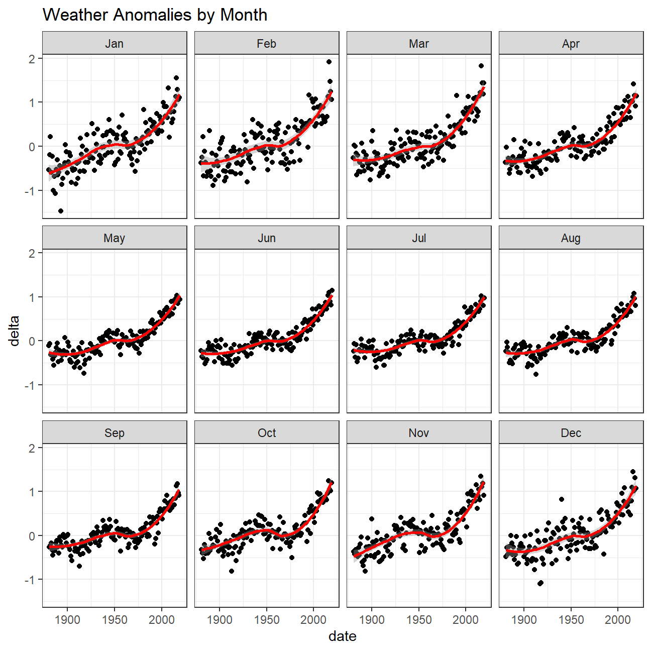
Based on our plots below, the effect of increasing temperature does not depend on month since the smoothing lines across months in different years are quite similar in shape and point values.
ggplot(tidyweather, aes(x=date, y = delta))+
  geom_point()+
  geom_smooth(color="red") +
  facet_wrap(~month) +
  theme_bw() +
  labs (
    title = "Weather Anomalies by Month"
  )
Looking at the data in time intervals
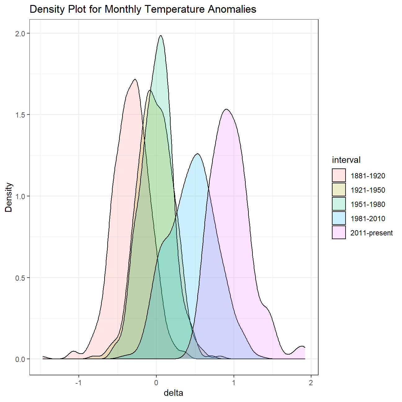
We grouped data into different time periods to study historical data. We chose a time frame called comparison that groups data in five time periods: 1881-1920, 1921-1950, 1951-1980, 1981-2010 and 2011-present.
We removed data before 1800 using filter. Then, we used the mutate function to create a new variable interval which contains information on which period each observation belongs to and assigned the different periods using case_when().
comparison <- tidyweather %>%
  filter(Year>= 1881) %>%     #remove years prior to 1881
  #create new variable 'interval', and assign values based on criteria below:
  mutate(interval = case_when(
    Year %in% c(1881:1920) ~ "1881-1920",
    Year %in% c(1921:1950) ~ "1921-1950",
    Year %in% c(1951:1980) ~ "1951-1980",
    Year %in% c(1981:2010) ~ "1981-2010",
    TRUE ~ "2011-present"
  ))
Now that we have the interval variable, we created a density plot to study the distribution of monthly deviations (delta), grouped by the different time periods we are interested in.
From the plots below, we could see that the most frequent monthly delta values among these time intervals gradually shifted from ~ -0.25 to ~ 0.8, from 1881 - 1920 to 2011 - present, showing the underlying trend of temperature increase across the past centuries.
ggplot(comparison, aes(x=delta, fill=interval))+
  geom_density(alpha=0.2) +   #density plot with tranparency set to 20%
  theme_bw() +                #theme
  labs (
    title = "Density Plot for Monthly Temperature Anomalies",
    y     = "Density"         #changing y-axis label to sentence case
  )
Average annual anomalies
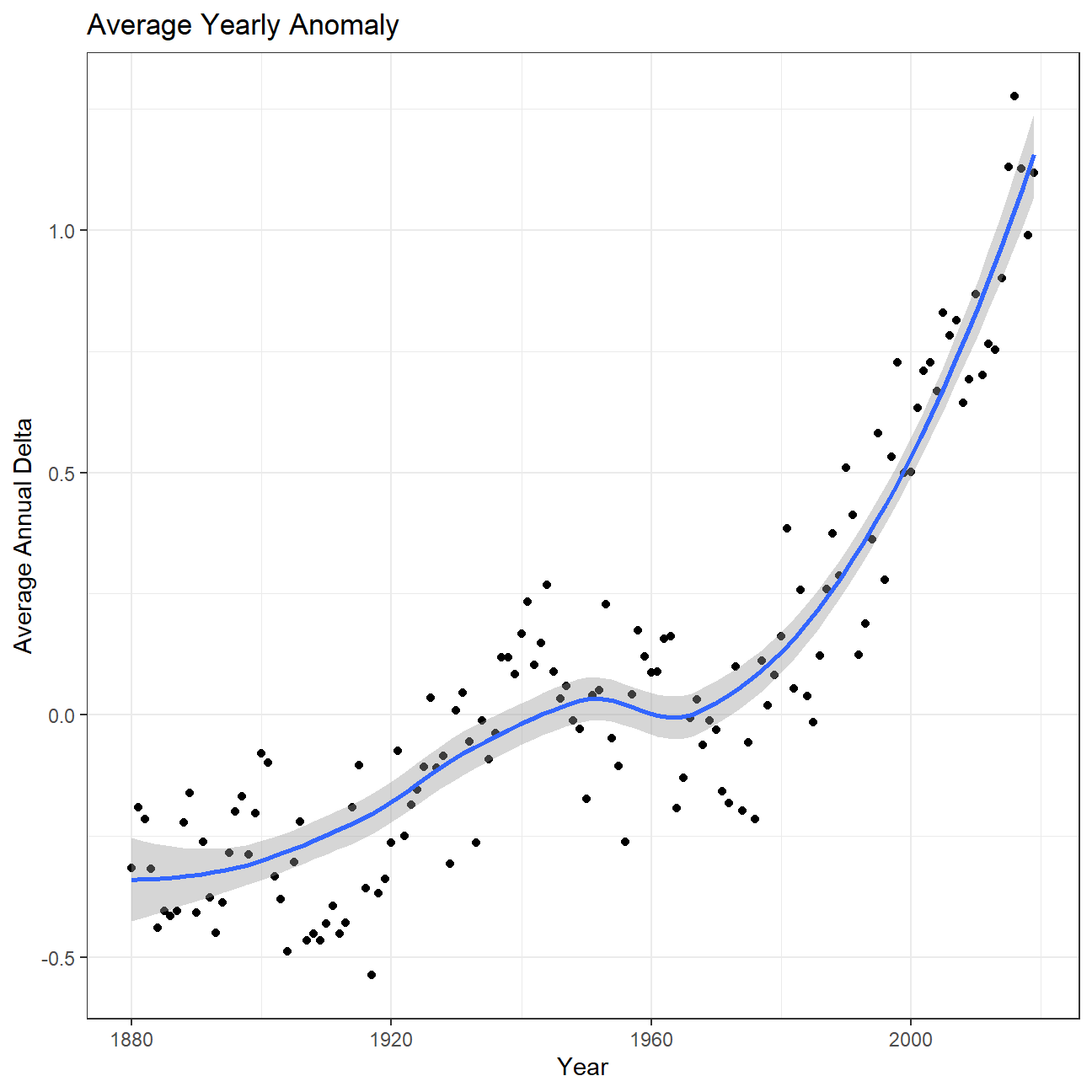
So far, we have been working with monthly anomalies. However, we are interested in average annual anomalies. We did this by using group_by() and summarise(), followed by a scatter plot to display the result.
Unsurprisingly, the average annual anomalies demonstrated the same trend as the monthly anomalies across different years since, as discussed above, the weather anomalies does not depend on months but on years.
#creating yearly averages
average_annual_anomaly <- tidyweather %>%
  group_by(Year) %>%   #grouping data by Year

  # creating summaries for mean delta
  # use `na.rm=TRUE` to eliminate NA (not available) values
  summarise(annual_average_delta = mean(delta, na.rm=TRUE))

#plotting the data:
ggplot(average_annual_anomaly, aes(x=Year, y= annual_average_delta))+
  geom_point()+

  #Fit the best fit line, using LOESS method
  geom_smooth() +

  #change to theme_bw() to have white background + black frame around plot
  theme_bw() +
  labs (
    title = "Average Yearly Anomaly",
    y     = "Average Annual Delta"
) 
Confidence Interval for delta
NASA points out on their website
A one-degree global change is significant because it takes a vast amount of heat to warm all the oceans, atmosphere, and land by that much. In the past, a one- to two-degree drop was all it took to plunge the Earth into the Little Ice Age.
We constructed a confidence interval for the average annual delta since 2011, both using a formula and a bootstrap simulation with the infer package.
formula_ci <- comparison %>%
  filter(interval == "2011-present") %>%
  # what dplyr verb will you use?
  summarize(mean_delta = mean(delta, na.rm = TRUE), SD_delta = sd(delta, na.rm = TRUE), count_delta = n(),
            SE_delta = SD_delta/sqrt(count_delta), lower95_delta = mean_delta - qnorm(0.025,0,1)*SE_delta, upper95_delta = mean_delta + qnorm(0.025,0,1)*SE_delta)

formula_ci
## # A tibble: 1 x 6
## mean_delta SD_delta count_delta SE_delta lower95_delta upper95_delta
## <dbl> <dbl> <int> <dbl> <dbl> <dbl>
## 1 0.966 0.262 108 0.0252 1.02 0.916# use the infer package to construct a 95% CI for delta
set.seed(1234)
bootstrapped_CI <- comparison %>%
filter(interval == "2011-present") %>%
specify(response = delta) %>%
generate(reps = 1000, type = "bootstrap") %>%
calculate(stat = "mean") %>%
get_confidence_interval(level = 0.95, type = "percentile")
bootstrapped_CI## # A tibble: 1 x 2
## lower_ci upper_ci
## <dbl> <dbl>
## 1 0.917 1.02From this data we can observe that the 95% confidence intervals of the mean temperature anomaly calculated from the formula method and the bootstrap simulation are similar (~0.916, 1.02). This indicates that we are 95% confident that the average temperature delta is between ~0.916 and 1.02. In the formula method, we carried out our calculation directly on the temperature anomalies data after 2011. While in the bootstrap simulation, we took 1000 bootstrap samples (large enough samples; samples with replacement and same sample size). Since the bootstrap simulation got similar results as using formulas directly, our estimation of the confidence interval should be quite accurate.
Therefore, in the words of Dylan Thomas:
Do not go gentle into that good night,
Rage, rage against the dying of the light
Consider the choices you make in your daily life, your decisions on the business level and perhaps donate or volunteer!