TfL
COVID, the unprecedented lockdown and the sociological conundrum that followed have surely shaped our daily lives for the foreseeable future. These make even as trivial topics as bike rentals ripe for analysis. Below I will try to walk you through how I map the impact that COVID has had on the popular Santander bicyles available on every street corner in London.
First I import the latest data about daily cycle hires from TfL:
url <- "https://data.london.gov.uk/download/number-bicycle-hires/ac29363e-e0cb-47cc-a97a-e216d900a6b0/tfl-daily-cycle-hires.xlsx"

# Download TFL data to temporary file
httr::GET(url, write_disk(bike.temp <- tempfile(fileext = ".xlsx")))
## Response [https://airdrive-secure.s3-eu-west-1.amazonaws.com/london/dataset/number-bicycle-hires/2020-09-18T09%3A06%3A54/tfl-daily-cycle-hires.xlsx?X-Amz-Algorithm=AWS4-HMAC-SHA256&X-Amz-Credential=AKIAJJDIMAIVZJDICKHA%2F20201020%2Feu-west-1%2Fs3%2Faws4_request&X-Amz-Date=20201020T213428Z&X-Amz-Expires=300&X-Amz-Signature=b8ec178b72cc774e5d623a616635055139eae3fc8364bb2440927ca5011543e8&X-Amz-SignedHeaders=host]
## Date: 2020-10-20 21:34
## Status: 200
## Content-Type: application/vnd.openxmlformats-officedocument.spreadsheetml.sheet
## Size: 165 kB
## <ON DISK> C:\Users\Bartek\AppData\Local\Temp\Rtmp8IZ5wV\file57bc35747482.xlsx# Use read_excel to read it as dataframe
bike0 <- read_excel(bike.temp,
sheet = "Data",
range = cell_cols("A:B"))
# change dates to get year, month, and week
bike <- bike0 %>%
clean_names() %>%
rename (bikes_hired = number_of_bicycle_hires) %>%
mutate (year = year(day),
month = lubridate::month(day, label = TRUE),
week = isoweek(day))Showing TfL bike rental changes by month in each year vs a running average
expected_per_month <- bike %>%
  filter(year>=2015 & year<=2019) %>%
  group_by(month) %>%
  summarize(expected_per_month = mean(bikes_hired))

bike %>%
  filter(year>=2015) %>%
  group_by(year, month) %>%
  summarize(mean_per_month = mean(bikes_hired)) %>%
  left_join(expected_per_month) %>%
  ggplot(aes(x = month,
             group = 1)) +
  geom_line(aes(y = mean_per_month)) +
  geom_line(aes(y = expected_per_month),
            colour = "blue",
            size = 0.7) +
  geom_ribbon(aes(ymin = expected_per_month,
                  ymax = pmax(mean_per_month, expected_per_month)),
              fill = "#9EE09C", alpha = 0.5) +
    geom_ribbon(aes(ymin = pmin(mean_per_month, expected_per_month),
                  ymax = expected_per_month),
              fill = "#FC787E", alpha = 0.5) +
  facet_wrap(~ year) +
  labs(title = "Monthly changes in TfL bike rentals",
       subtitle = "Change from monthly average shown in blue \n and calculated between 2015-2019",
       x = "",
       y = "Bike rentals",
       caption = "Source: TfL, London Data Store") +
  theme_minimal()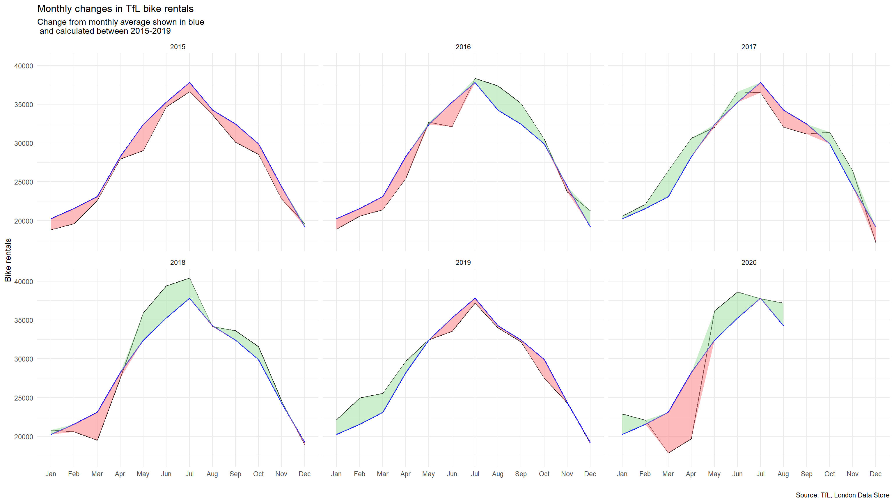
There are some interesting insight to draw from this graph, like the consistently lower usage of bikes across of 2015 or the steady adoption of bikes in the following years. But what is the most interesting is the wild shifts in the number of bikes in 2020, with a massive dip across February, March and April during the most intense lockdown and a huge rebound in May, June, July and August where the bikes rentals leaped back over the average. Like a cork on a plastic bottle being squeezed, after the toils of isolating people’s interest in getting outdoors exploded as soon as it was legal again to do so.
expected_per_week <- bike %>%
  filter(year>=2015 & year<=2019) %>%
  group_by(week) %>%
  summarize(expected_per_week = mean(bikes_hired))

bike2 <- bike %>%
  filter(year>=2015) %>%
  group_by(year, week) %>%
  mutate(mean_per_week = mean(bikes_hired)) %>%
  left_join(expected_per_week) %>%
  mutate(pos_neg = case_when(
           mean_per_week/expected_per_week - 1 >= 0  ~ "positive",
           mean_per_week/expected_per_week - 1 < 0  ~ "negative"))


bike2 %>%
  ggplot(aes(x = week,
             y = mean_per_week/expected_per_week - 1,
             group = 1)) +
  geom_rect(aes(xmin = 13, xmax = 26, ymin = -Inf, ymax = Inf), alpha = 0.1, fill = "#EDEDED") +
  geom_rect(aes(xmin = 39, xmax = 53, ymin = -Inf, ymax = Inf), alpha = 0.1, fill = "#EDEDED") +
  geom_line() +
  geom_ribbon(aes(ymin = 0,
                  ymax = pmax(mean_per_week/expected_per_week - 1, 0)),
              fill = "#9EE09C", alpha = 0.5) +
    geom_ribbon(aes(ymin = pmin(mean_per_week/expected_per_week - 1, 0),
                  ymax = 0),
              fill = "#FC787E", alpha = 0.5) +
  facet_wrap(~ year) +
  labs(title = "Weekly changes in TfL bike rentals",
       subtitle = "% change from weekly averages \n calculated between 2015-2019",
       y = "",
       caption = "Source: TfL, London Data Store") +
  theme_minimal() +
  scale_y_continuous(breaks = c(-0.6, -0.3, 0, 0.3, 0.6),labels = scales::percent) +
  scale_x_continuous(breaks = c(13,26,39,53)) +
  geom_rug(sides = "b", colour = case_when(
                                  bike2$pos_neg == "negative" ~ "#FC787E",
bike2$pos_neg == "positive" ~ "#9EE09C")) 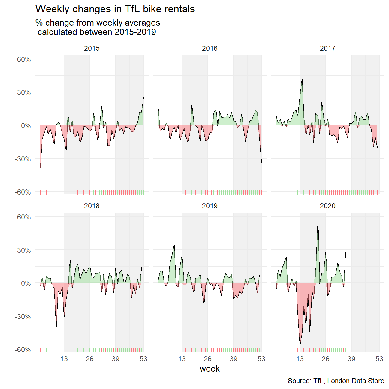
The weekly trends show the same underlying patterns, with more precision!
Using this data to map other events beyond the impact of COVID such as the impact of weather or London wide events (such as a tube strike) might be an interesting piece of analysis to improve the adoption of cycling in the city!